01Overview
I interned at Indeed as a UX design intern. I worked with my mentor Michael Swingler on designing user input screens for Indeed’s mobile app, and I got to watch Indeed’s design system grow over the summer.
Goal: increase the number of “applies” (when someone taps Apply) on mobile.
The bet behind my project had two parts:
- Hypothesis: more data about what a job seeker wants leads to more relevant jobs, and more relevant jobs lead to more applies.
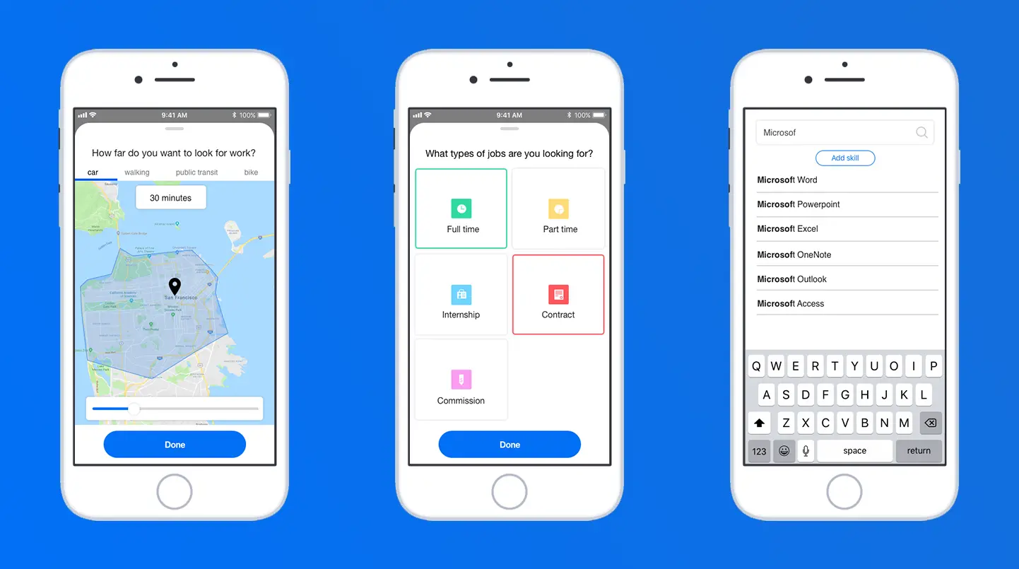
- Idea: a short series of screens that collect that data and help Indeed match job seekers to jobs they will be interested in.
Exploring that idea was my project for the summer.
02Research
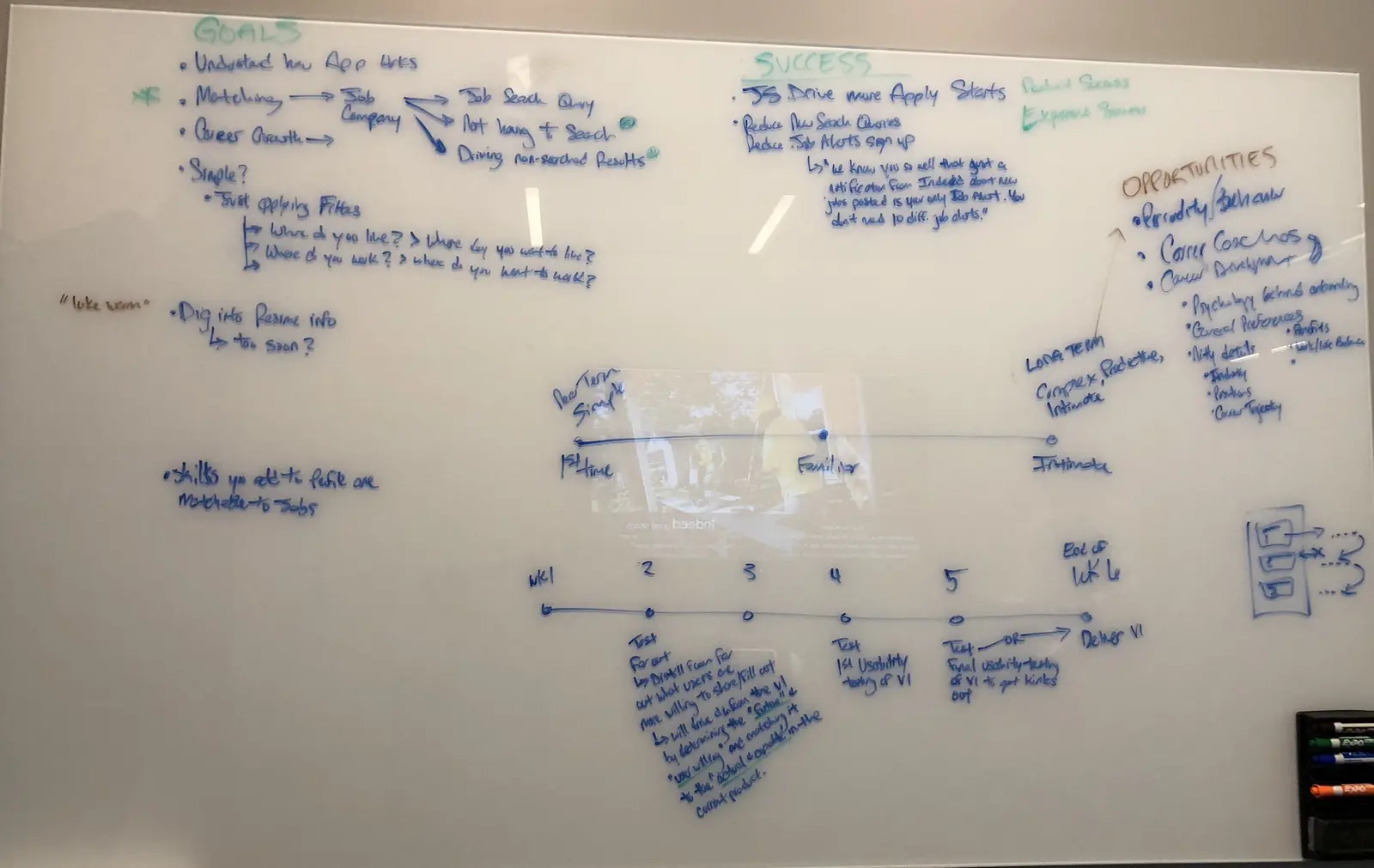
I started by learning Indeed’s products, talking with my mentor and PM, and reading existing research, including Indeed’s personas. I can’t share Indeed’s personas or research here, but with them in mind I focused on three cases:
- New users
- Currently active users
- Users coming back after a while away
Competitive analysis
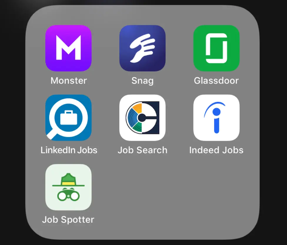
I went through related job search apps and paid attention to the questions and inputs they used across the job seeker’s journey. I no longer have the write-up of that research, since it stayed with Indeed after my internship.
Synthesis
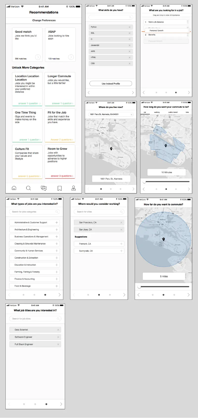
From Indeed’s data and personas plus what competitors do, these looked like the right topics to ask job seekers about during onboarding:
- Job type (full time, part time and so on)
- Salary
- Location
- Company
- Experience level
- Where they are in their job search
- Urgency
- Lifestyle preferences
Some of these were already just query filters on Indeed’s products. The new idea was to store them on a job seeker’s profile to improve future results and suggestions.
03Ideation
With those topics in mind, I sketched screens for each kind of input.
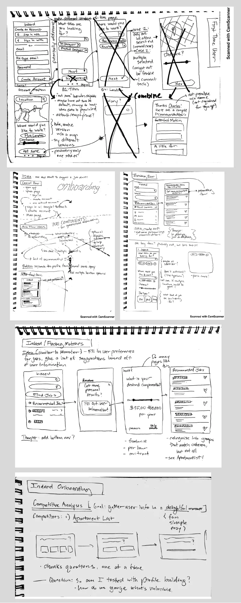
Initial mockups
I digitized the sketches and met regularly with my mentor and PM to get feedback on the screens.
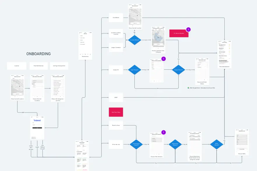
User flow
I used Whimsical to map the paths a job seeker could take through the onboarding screens to a page of relevant job recommendations. You can look at the flow in Whimsical.
Interaction prototypes
I also explored the interactions for a couple of the screens.
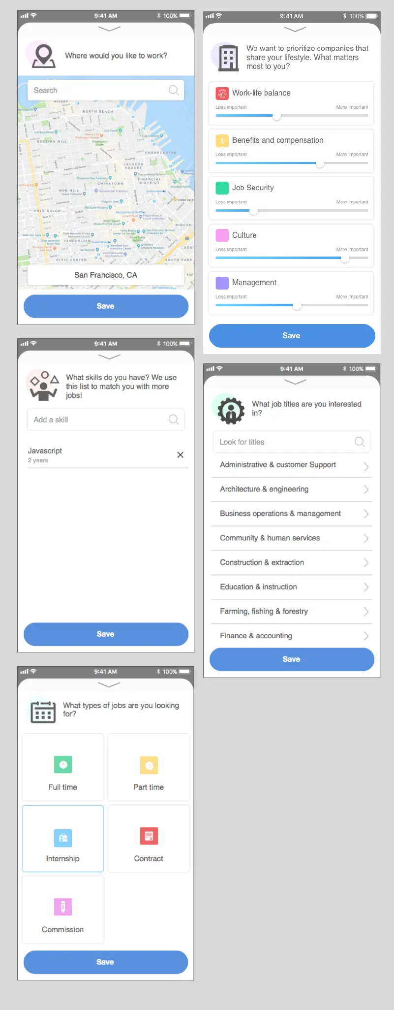
Upping the fidelity
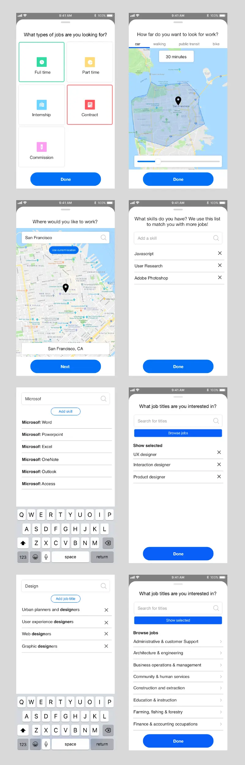
Then I added color and visual design to the mockups, and we narrowed the set to the screens we wanted to prototype and test.
04Prototype and testing
The Framer prototype
I learned Framer for this project and it became my favorite prototyping tool: more interactive than InVision, more flexible and scalable than Principle, and faster than building it in HTML, CSS and JavaScript.
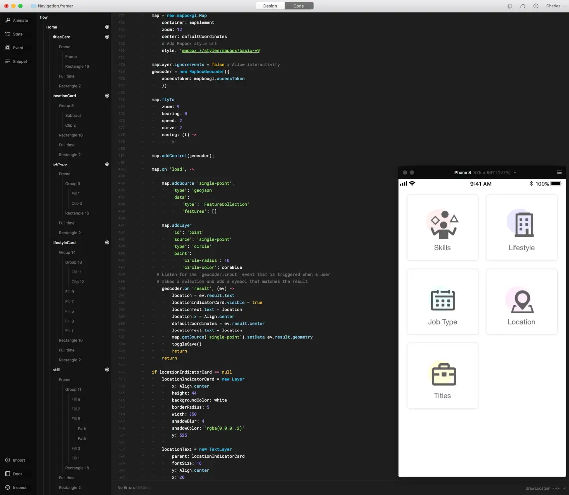
The location screen was the most fun to build. I used the Mapbox API for an interactive map and added autocomplete to the input, so testers used a real interaction instead of a fixed answer.
The prototype I tested was hosted on Framer’s cloud, and it is no longer online.
User testing
I worked with UX researcher Georgia Gallavin to test the prototype through UserTesting.com with 8 people on their own phones.
What we wanted to learn
- Do job seekers see the value of the onboarding, and is it clear how it helps their search?
- Are the categories relevant and desirable? What is missing or confusing?
- Can job seekers finish the exercises easily? Where does it hurt?
Top takeaways
- Overall, job seekers understood the exercises as the first step in matching them with relevant jobs.
- They expected to enter salary and experience level during onboarding.
- Creating a skill from scratch, instead of picking from the list, was unclear. Most did not notice the show/hide control for their selected job titles.
More detail
- One tester preferred to search for jobs first instead of entering preferences before seeing recommendations.
- Lifestyle criteria felt novel, but testers struggled to see how they would map to relevant jobs.
- Testers treated Skills as a place to pick from an existing list using the search box.
- They added a location several ways: typing a zip code, using the autosuggest dropdown, or choosing their current location.
- They often looked for a way to cover a broader area on the map, to show how far they would travel.
- Most typed an industry or job title straight into the search box instead of browsing categories.
05Moving forward
Iterate
I took the feedback from testing into the final designs, and worked with content strategist Michael Lawrence on the copy for each screen.
Next steps
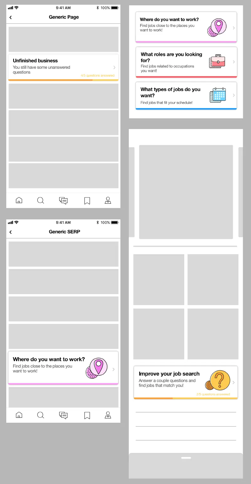
The user flow for the whole mobile app was still being worked out by my mentor’s team, so it was not certain where my screens would end up. Indeed was moving toward a native version of the app, and I hoped some of these ideas would show up in it.
One idea I had: let a call to action for each screen float among the job feed, so job seekers can fill in their information when they have a minute instead of all in one sitting.
06Takeaways
Think ahead, then scale back
We created and tested ideas that might not be possible with Indeed’s current data and technology. That was deliberate: it let us explore, so Indeed could later apply the insights, while engineers took what was practical now.
Mentorship matters
My mentor has 20 years in industry, and his art background helped me, as a student whose main education was in computer science. He sat across from me every day and was glad to answer my questions, which made the internship a good one and pushed me to grow as a designer.