01Problem and team
During Fall 2017 I took CS160 (User Interface Design and Development), taught by John Tang. The theme was “Bursting Echo Chambers in Social Media”, and we were asked to design a web app for it by following a human-centered process.
The idea: Socratic is a place to discuss current events with people of different opinions. It exposes you to other perspectives and promotes thoughtful, non-hostile conversation.
Our team of four had two developers (Genji and Gemma), a designer (Takara), and me, a bit of both. Takara and I led the design, from interviewing people to wireframes and visual style. For the code prototype, Genji and Gemma worked on the backend and I built the front-end components.
02Needfinding
We started our user research by attending two events where people expressed a diversity of opinions.
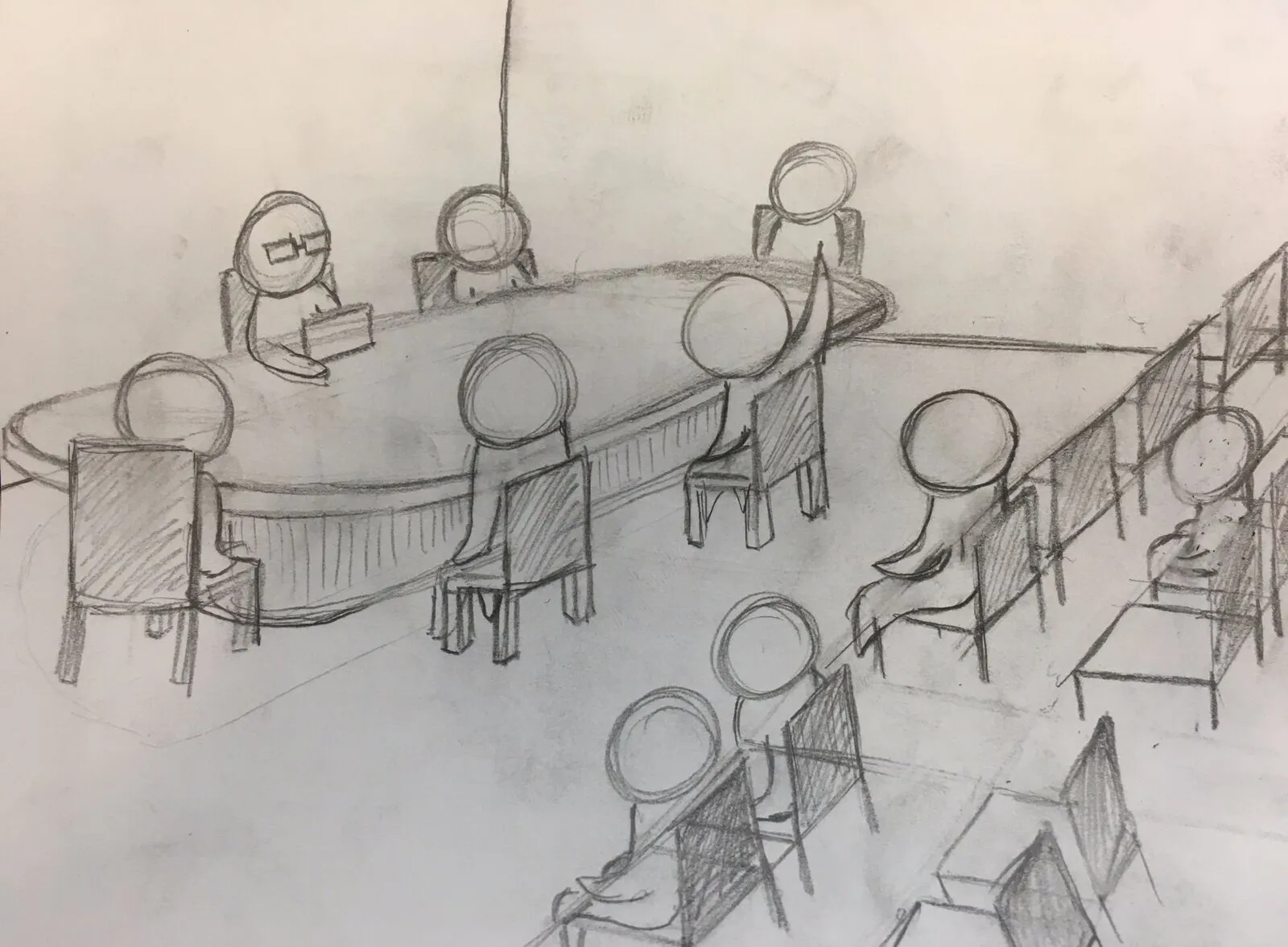
Event 1: MENA Salon, “Free Speech and Exclusion on American Campuses”
The Center for Middle Eastern Studies hosts an informal weekly coffee hour and guided discussion of current events in the Middle East and North Africa.
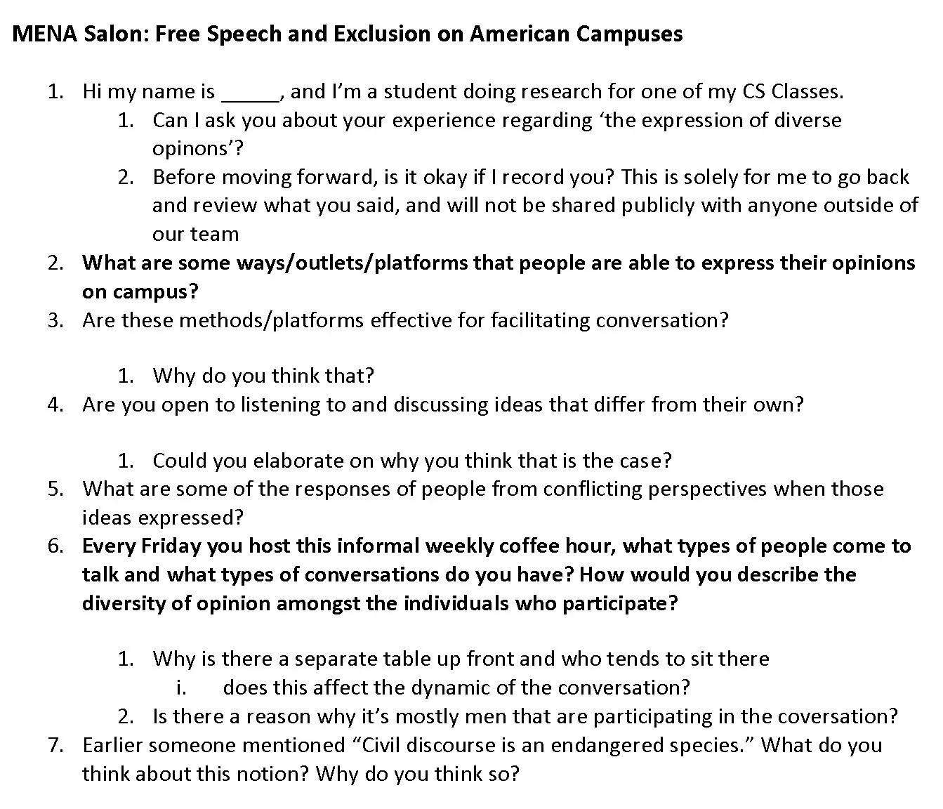
After the event we interviewed a couple of people with this discussion guide.
What we took away from watching the event and interviewing people:
- Conversation can be directed by a source of authority.
- Conversation can be smooth and efficient when there is a set of rules people know about and follow.
- Wording matters. Words that mark a statement as a subjective opinion let thoughts be challenged, or even supported.
- Discussion is richer when people understand what is being said and share the same factual knowledge as the speakers.
- People are more likely to talk and listen to people who are like-minded.
- People are more likely to listen if you listen to them, even when your opinion differs from theirs.
- It is hard to have or find open conversation with people who don’t share your perspective.
Event 2: “White Supremacy, Gender, and Speech in the wake of Charlottesville”
A panel of four speakers on perspectives on white supremacy, gender and free speech.
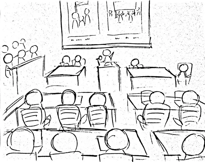
We interviewed two law students who attended. These interviews were briefer, because people seemed to be on their way out.
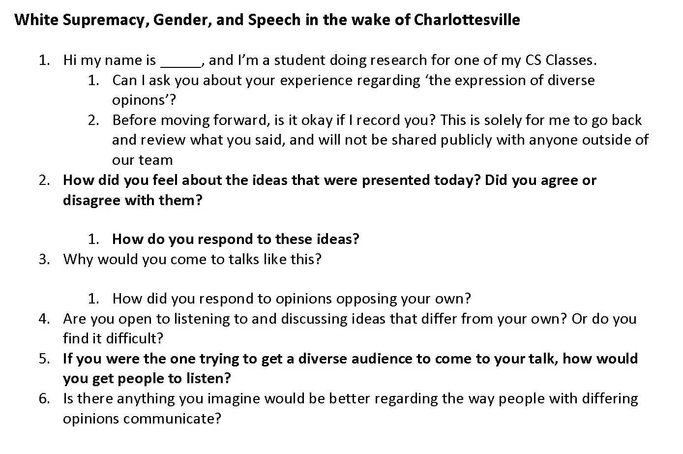
Takeaways from those interviews:
- Conversations about controversial topics need mutual trust and respect to be effective.
- Relevant topics are a strong motivator for attending talks, even ones with opposing views.
- People groups generally will not tolerate opinions that put down their humanity.
- The viewpoints of these talks should be presented with honesty and transparency.
03POV + HMW
We did affinity mapping to group our insights, organize our data and narrow the design space.
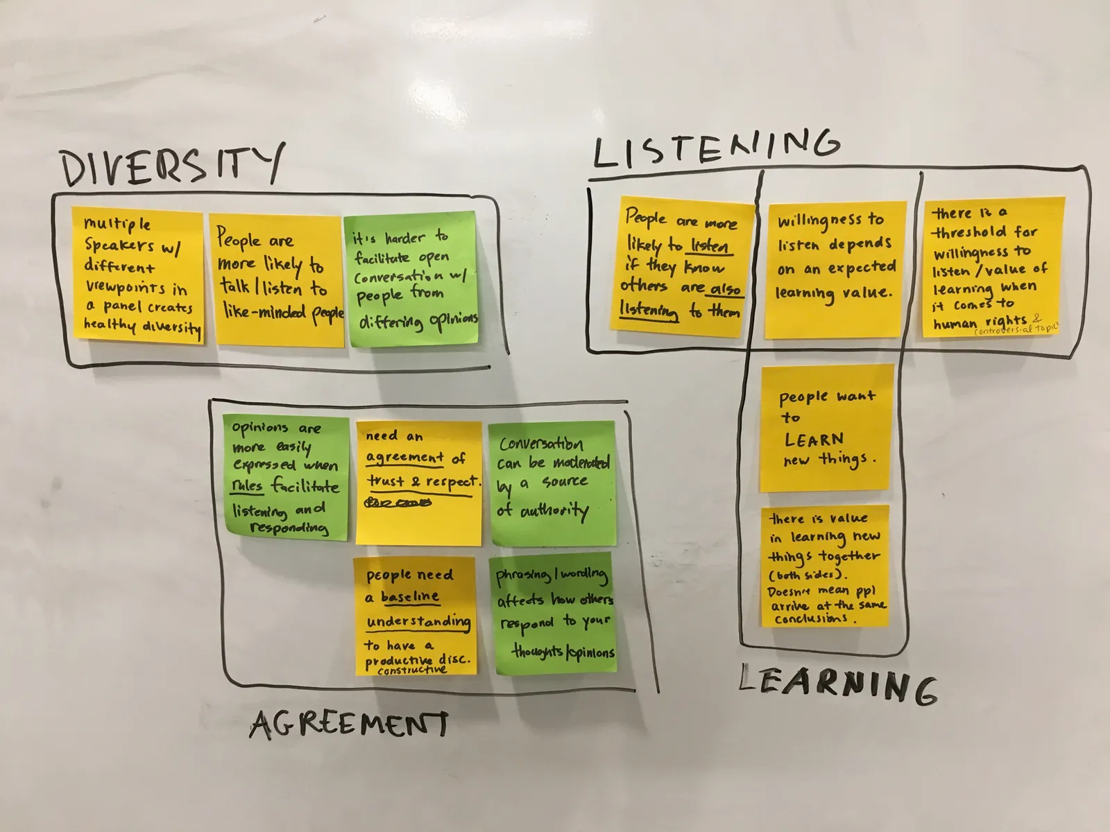
Then we wrote Point of View and How Might We statements to guide ideation.
Point of view
- We met a group of older men who regularly discuss current events involving the Middle East and North Africa. We were amazed to learn that they were willing to listen and converse with people whose perspectives differ from theirs, but that there wasn’t really anyone from a radically different background. It would be game-changing if we could get people from drastically different backgrounds and opinions to take part in their discussions.
- We met two open-minded law students who are passionate about what they believe, but still attend talks they do not agree with. We were amazed to learn that their main reason for going was learning value, whether or not the information supported their existing belief. They did not expect their opinion to change, and learning from the other side does not mean arriving at its conclusion. It would be game-changing if we could focus on learning, rather than argument and persuasion.
How might we
- How might we facilitate a space for learning rather than trying to persuade and conquer?
- How might we establish decorum and a baseline understanding of factual information to hold a constructive discussion?
04Ideation
From the research we brainstormed five possible solutions and picked one to try:
- Chat rooms categorized by topic
- Dedicated sites for college students to pick speakers
- A microphone where people can only speak when they have it, and otherwise have to listen
- An online board where people post opinions and respond to other people’s opinions (the one we chose)
- A feed that shows you posts that are the opposite of what you would want
05Prototype
We expanded on idea 4 and built a working prototype with Meteor and Handlebars, following this general user flow.
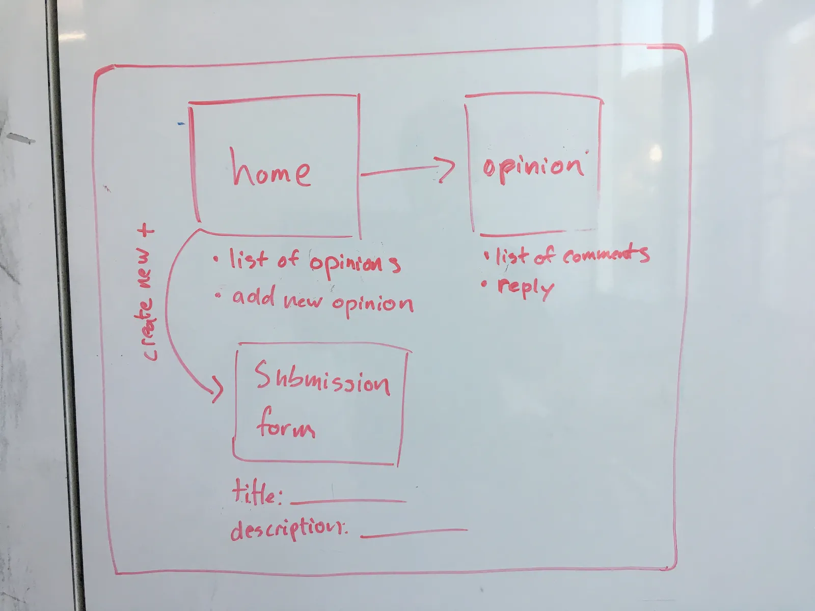
The first screen is a list of people’s submitted opinions, each with a short description.
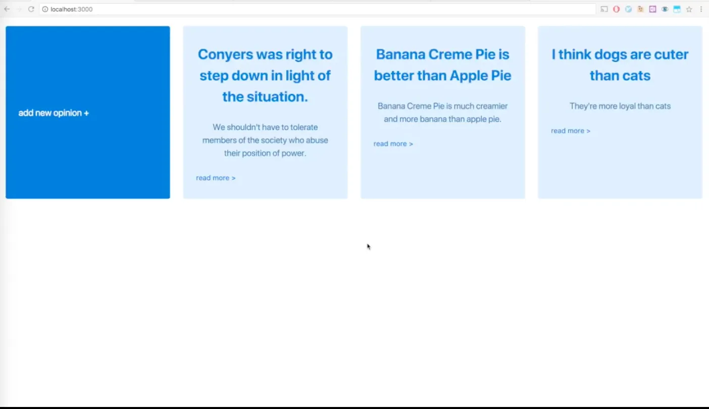
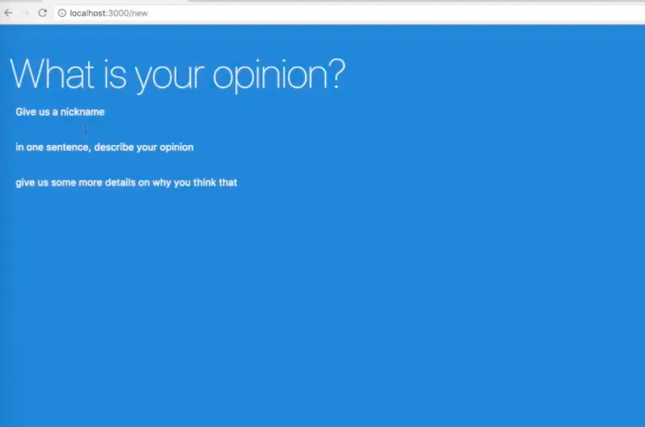
“Add new opinion” opens a page to enter a new post.
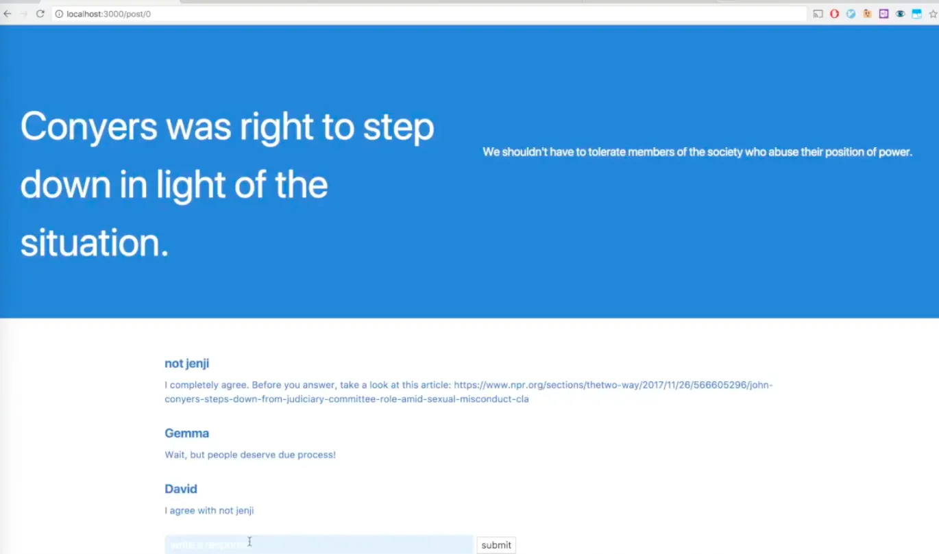
Clicking an opinion card reveals a comment thread where you can discuss it with other users.
06User testing
We tested with 5 people, who talked out loud while doing this core task: take part in a conversation under someone else’s post and gain new knowledge from the exchange. (We simulated the other users’ replies on our end so the tester could reply.)
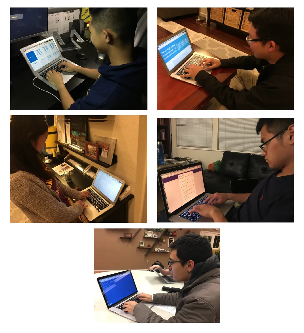
Afterward we asked each tester to fill out a Google form with their feedback. We found many places to improve:
- Navigation was difficult.
- The core task, and what the site was meant for, was unclear.
- The “Give us a nickname” prompt when adding an opinion was confusing.
- The site might be easier to grasp with a name.
- Opinions should show a username, otherwise people think they are just topics, not someone’s opinion.
- It was unclear what the comments were, what people were trying to do in them, and what standpoints they came from.
- An ongoing conversation was hard to follow.
- The comment section didn’t look like a comment section.
Most of these problems came from not having time to build a fully fleshed-out app. That was okay, since we mainly wanted to test the concept, and the concept is where we got the most valuable feedback:
- The open-endedness of “share an opinion” led to less thoughtful topics like “Pie is better than cake.”
- The comments let trolls and negative comments spam the threads.
07Iterate
With that feedback we set two goals:
- Engage users with more directed content, to focus the conversation.
- Encourage discussion on important topics among people of different backgrounds.
And two steps to get there: guide discussion with prompts and questions, and include articles on current events from different parts of the political spectrum.
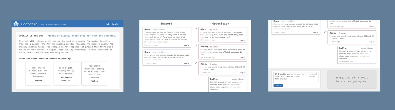
Socratic 2.0
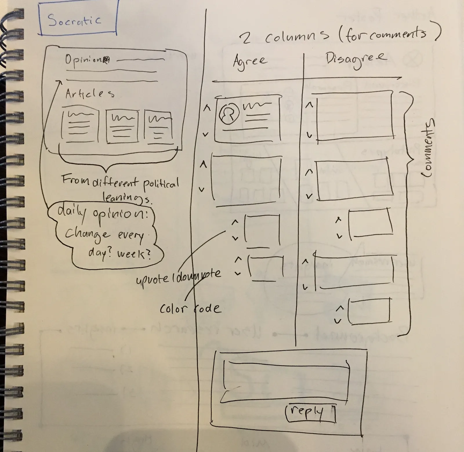
- One opinion, related to current events. Only one at a time, so all traffic funnels into one discussion. It changes every week.
- Three articles about the event to read. Each comes from a different part of the political spectrum, inspired by AllSides.
- Agree and disagree buttons for the stated opinion.
- Two comment threads, one for those who agree and one for those who disagree. Replies are color-coded by position, and the comments stay hidden until you pick one.
- Comments with the most points rise to the top. The catch: you can only upvote comments from people who disagree with you, and you can’t see the score of comments from people who agree with you.
We made a quick sketch before moving on to high-fidelity screens.
08Final design and demo
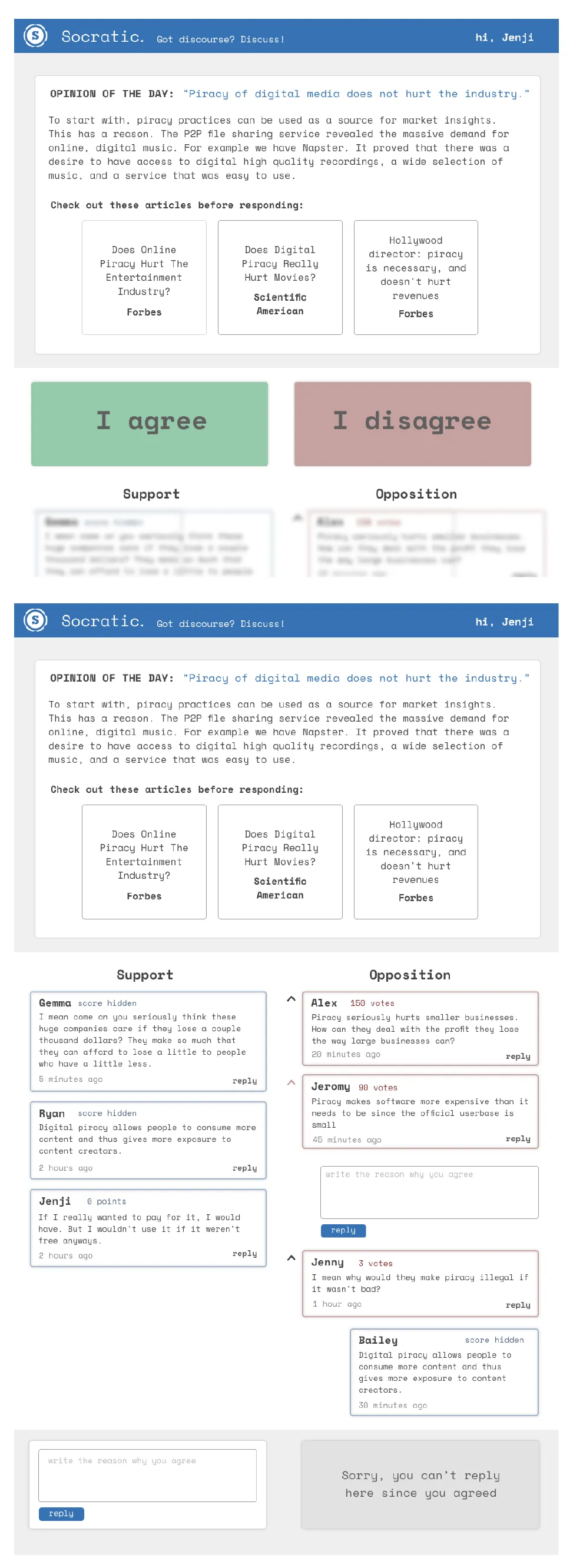
We built a hi-fi prototype and a demo video to present the project to the class. Watch the demo ↗ or look through the code on GitHub ↗.
If we had more time
- Add downvotes for people who share your view, so the other side can’t just upvote the views they most agree with.
- Add a page to view previous discussions and opinions.
- Make sure users read all three articles before they can click “agree” or “disagree.”
- Add a “Neutral” option. Opinions aren’t so black and white!
- Add optional user profiles, so users don’t have to commit to an account to take part.
09Takeaways
User testing is super super super valuable
We found many ways to improve with just a few people going through our prototype. They ran into issues we would never have found ourselves.
Code takes time, keep that in mind
It takes much longer to build something that works with a JavaScript framework than to make something pretty in Sketch and Illustrator. It seems obvious, but being conscious of it helps you keep to the project timeline and spares you all-nighters fixing bugs.
The final product can look very different from your first solution.